Team Project • Cal Poly SLO • Digital Health
Campus Health and Wellbeing App

TEAM
4 Designers
3 Designers/PMs
TIMELINE
Winter 2023
MY ROLE
Product Designer
UX Researcher
SKILLS
0 -1 Product Design
UX/UI Design
User Interviews
Competitive Analysis
Usability Testing
Design Systems
Prototyping
THE PROBLEM
How might we integrate the unique resources of Campus Health and Wellbeing into an interactive mobile application to improve student accessibility and increase awareness?
Cal Poly SLO's Campus Health and Wellbeing services encompass basic needs, counseling, and medical services for students. As students ourselves, our team experienced firsthand the challenges of navigating these services and discovered that many resources — such as the food pantry and pharmacy — were underutilized. Students often didn't know these resources existed, struggled to navigate the Health and Wellbeing Center's website, or simply didn't have time to visit in person.
Our team at iter8, Cal Poly's first student-led product design agency, saw an opportunity to design a mobile app that improves awareness of and access to Health and Wellbeing resources, giving students a fast, convenient way to find information and connect with the Health Center from anywhere.
Quick Summary:
I designed the end-to-end Health Services and appointment booking experience. I also co-designed the app's visual design system. Our research through this project also directly reflected the Health Center's real-world website redesign that followed.
RESEARCH
We interviewed three groups: regular users of the Health Center, students who have never used it, and the student leads and staff who run it.
This let us pinpoint pain points and understand the existing user experience from every angle, discovering that the students who never showed up had different barriers than the ones who did. We needed both perspectives to design something that actually increased access, not just improved an experience that only existing users would ever see.

Key Takeaways:
Medical Appointment Scheduling is Challenging
Students can only schedule in person or via phone, with limited advanced booking options.
Mental Health Resources are Difficult to Find
Website information is disorganized.
Food Pantry Access is Inconvenient
To access the Food Pantry – a free on-campus resource that provides food and other basic essentials – students must physically visit to check availability, often finding it empty.
A Mobile Application is Desirable
100% of our interviewees expressed a strong interest in a mobile application and believed it would be beneficial.
We also researched the healthcare websites of other universities
We looked at the healthcare websites of other universities, reviewing effective and ineffective features to inform our prototype development.

IDEATION
Creating user flows for each of the main services we wanted to include in our app based on insights from our user research.
Based on user interviews, competitor analysis, and the existing Cal Poly Health and Wellbeing website, we prioritized the following key services for our mobile application: Food Pantry, Counseling, Pharmacy, and Health Services. For each, we developed user flows illustrating both student and employee access.

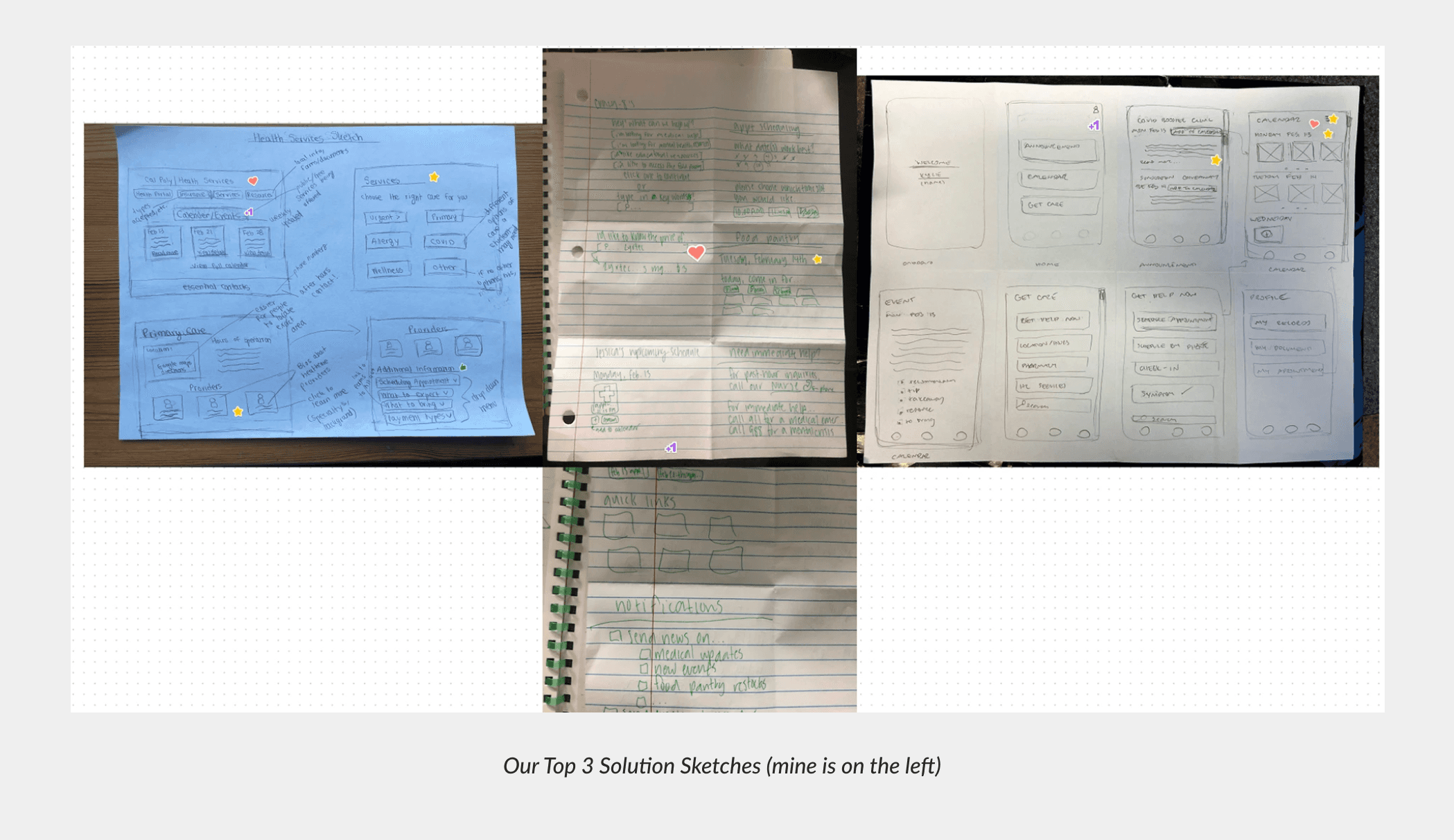
We each created solution sketches addressing various pain points and ideas from previous discussions, then shared, critiqued, and voted on our top three.
Some key design solutions we honed in on were:
A real-time Food Pantry inventory update page
A streamlined appointment booking process
A centralized calendar system for Health Center events
KEY CONTRIBUTIONS
Based on our research, user interviews, and competitor analysis, key features I included in the low-fidelity wireframes were:
A resources section for easy access to insurance information and document uploads
Upcoming Health Center–specific events
An FAQ section for students to get their non-urgent questions answered
A calendar overview for appointment scheduling in advance

I refined the design in the mid-fidelity wireframes by adding icons for improved visual clarity, updating the typeface to align with Cal Poly branding, and integrating the team-developed calendar and navigation bar components.

As we began working towards a high-fidelity prototype, our team decided to adjust our design system to ensure the app felt approachable and trustworthy to students. This mattered for a healthcare product especially because an overly clinical interface can quietly discourage students from engaging with services they need.
Alongside another designer and one of our PMs, I co-developed the new design system: we chose calming, welcoming colors that still convey official Cal Poly branding, a friendly sans-serif font to increase readability, and an original logo to represent both the Health Center and Cal Poly.

Before prototyping, I adjusted the high-fidelity wireframes based on team feedback by:
Implementing our new design system
Creating dropdown menus for FAQ, Service Choice, and Provider Preferences
Designing a final appointment confirmation screen
Incorporating consistent top header and emergency banner components


Through 1:1 Zoom usability tests with students unfamiliar with the Health Center, I assessed the prototype. For one student, I tracked task completion, errors, and perceived ease of use. For the other, I noted overall navigation ease and errors. My goal was to evaluate how well the app addressed user pain points and goals.

Positive Feedback:
Intuitive layout and helpful icons
Clear and welcoming visual style and language
Eye-catching and appealing overall aesthetic
Identified Pain Points:
Lack of a clear/functioning back button
Unclear links needing better call-to-action design
Inconsistent spacing and alignment
Changes made to Final Prototype:
Defined active buttons and increased clickable area
Precise spacing and alignment throughout the design
Refined paths to eliminate dead ends and ensure successful task completion and exploration
FINAL SOLUTION
The Campus Health and Wellbeing App!
Stay Up to Date
We incorporated a search bar for easy navigation of our app and included upcoming event notices, announcements, and a calendar section that includes personal and Health Center–wide events.
Book Ahead
Users can book appointments with Health Center professionals in advance for all of their health and wellbeing needs.
Pharmacy on the Go
Prescription pre-orders are designed to be easier to complete on the app and can be done in advance.
Know Before You Go
Daily inventory at the Food Pantry is featured in the top carousel for easy, remote access, and important announcements such as closures for the week and volunteer opportunities are included.
Find the Right Care Faster
Counseling services are conveniently located and simple to navigate based on the type of care a user is looking for.
REFLECTION
Outcomes and What I learned…
Impact on the Cal Poly Community
Concurrent with our project, Campus Health and Wellbeing was in the middle of redesigning their website. While our MVP wasn't built, the website that eventually launched addressed many of the exact pain points we'd identified: clear sections for each service, detailed Food Pantry access information, and ways for students to book medical appointments in advance. Seeing our research and design decisions validated by an independent, real-world redesign was a strong signal that we'd identified the right problems.
First Project with iter8!
Collaborating with a diverse team of students and engaging directly with various user groups significantly enhanced my ability to design for both user and organization needs, creating a product of value for Cal Poly administration and students. Designing for a healthcare context also pushed me to think beyond usability alone, understanding how visual tone, clarity, and trust affect whether someone in need actually engages with a resource. At the time of this project, I was very unaware of the Health Center and got to learn about it ust how many wellbeing resources are available to students.
If we had more time
If given more time for this project, it would have been helpful for us to also collect more quantitative data through user testing and feedback of our prototype. This would have allowed us to present more concrete findings to the Health and Wellbeing Center's development team to further highlight the potential impact of this project. Nonetheless, I am glad to see that our qualitative research findings reflect improvements made to a website used by students today.

